Fireside Digital
Case Study Summary
Project Type: UX/UI Design for Fireside Digital Marketing Agency
Objective: Redesign existing website UX/UI, brand aesthetic and user flows
Role: Analyze existing website pain points and user journeys, simplify site map, ideate new brand aesthetic, design high-fidelity wireframes for Desktop and Mobile, create feature space video
Team: 1 UX/UI Designer, 2 UX Strategists, 1 Web Developer and CEO of Fireside Digital
Duration: October - November 2023 (1 month)
Software: Figma, Photoshop, Illustrator, iMovie
Fireside Digital
Website Redesign
UX/UI Design Case Study
by Mackenzie Lisenby
Project Summary
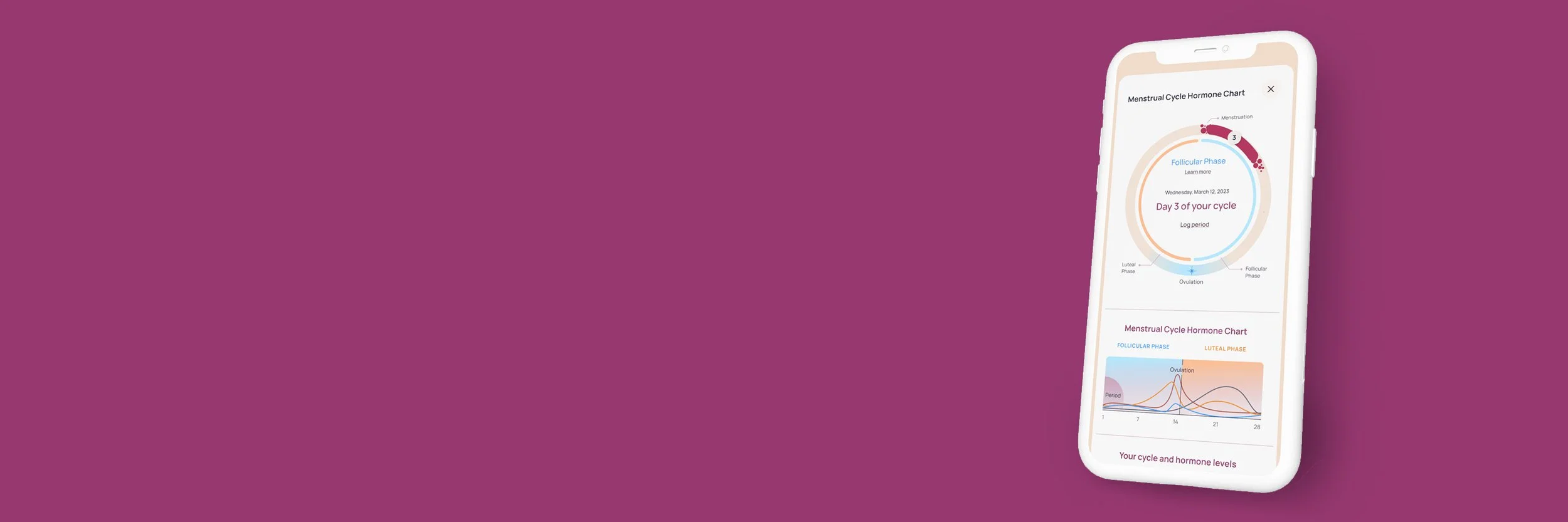
Ourself Health is a B2C Saas tech startup based in San Francisco, CA which is designing a new, innovative women’s health tracking app. The app allows users to track health symptoms, discover trends through analytics charts and calendars, and read articles about women’s health.
For four months, I worked as a UX/UI designer for Ourself Health and helped their team design complex user flows, create UI components and features, wireframe unique pages and menus, and ideate analytics displays for the app. I successfully helped the company design 40% of the flows and wireframes needed for their MVP launch in 2023, including the login flows, tutorial flows, homepage, menstrual health and individual health tracking flows and menus, profile menus, analytics charts and pop-up menus.
The Problem
Women frequently experience health symptoms that correlate with their menstrual cycle, hormone cycle, or other body cycles, but it is difficult to keep track of the frequency and severity of these symptoms. Because of this, these symptoms are often left untreated or overlooked, and in some cases could become more serious if left untreated for an extended period of time.
Ourself Health wanted to build a mobile app to help empower women and allow them to track and visualize all of their health data in one place.
The Solution
Create a user-friendly, all-encompassing women’s health tracking app designed to visualize health trends, track menstrual cycles, educate on women’s health and body cycles, and build an online community. This app must include over 260 common health symptoms, allow for daily tracking, provide visualization on both data charts and monthly calendars, have a private profile for each user, and be customizable for women of all ages and reproductive stages.
Create an Account

Sections to Build Out
Using Ourself’s existing style guide, component library, and rough wireframes, I helped design various UI designs and behaviors throughout the app to ensure ease of use for the customer. Section by section, I designed the user flows, built the wireframes for complex health tracking lists, and ideated the UI for data analytics on each of the following sections.
Onboarding

Home Screen

Favorites Page

Menstrual Health & Individual Symptoms
Ideation
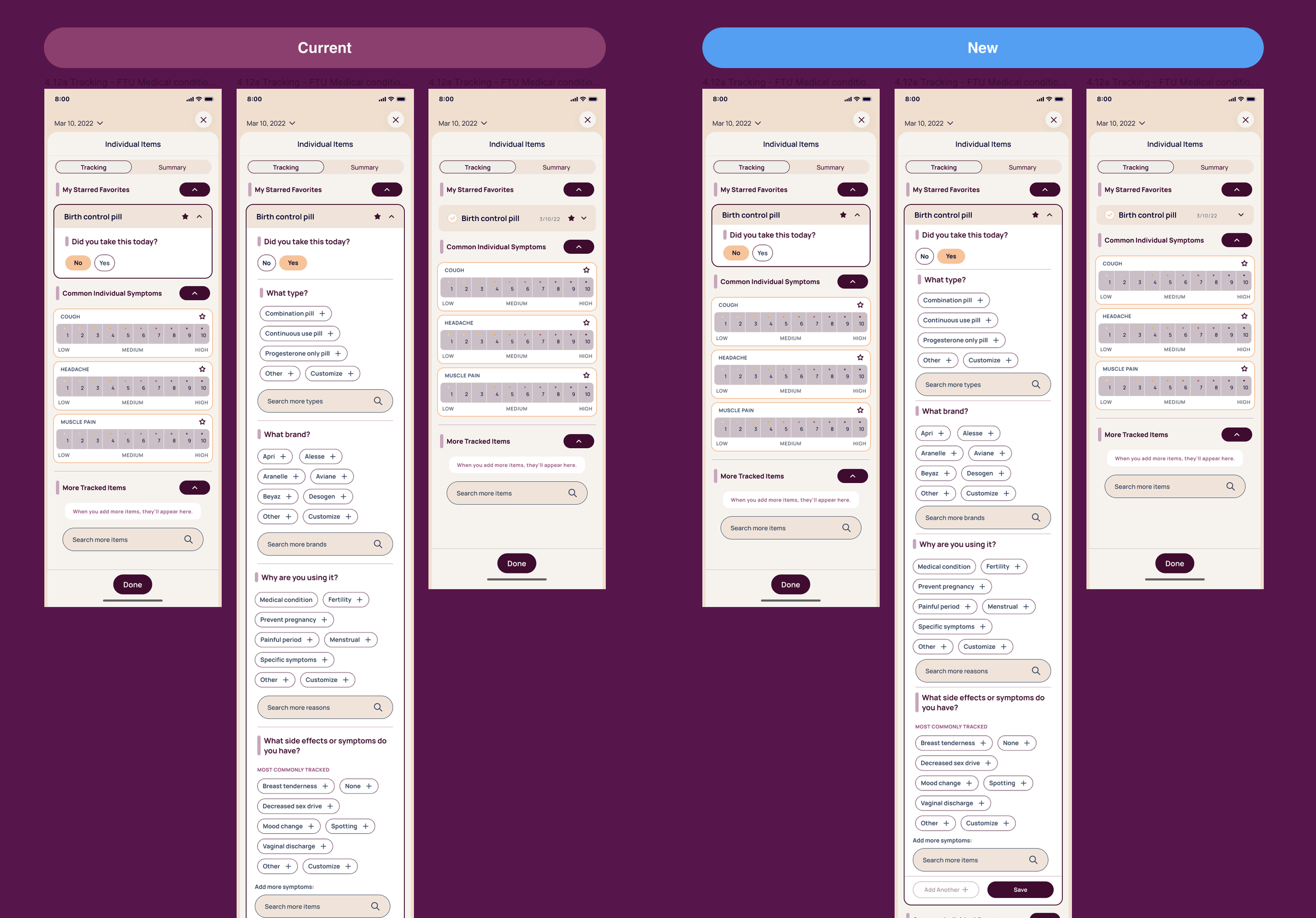
Based on the existing design system that Ourself had built, I ideated new designs for primary UI components of the app, as well as new user flows and wireframes throughout the tracking system. I built new components and wireframes for the homepage to help consolidate the information, and introduced a new slide card system at the top to educate the user on the body cycles tracked in the app. I also designed the login process to incorporate their new AVID security system, and the flow to customize login passwords.

Accessibility and Visibility
Part way through the process, the UX team and I decided to make a global change to our primary card components in order to condense the long lists and questionnaires on each tracking page. By decreasing the symptom card height and margins by 50%, we successfully decreased the average page height by 5-10% and therefore made the information more visible and accessible.


The most complex portion of the app is the tracking capabilities that require unique cards for a variety of different data types, such as binary test results, quantity/measurement fields, conditional expanding cards, and severity rating systems. I helped develop the design for these cards, and created a collapsible menu UI which would allow for all of the data to be accessible in one page, and helped with the user flows for favoriting and searching for specific health symptoms.
Results
The App successfully launched in December 2023 and is now available on the Apple Store.
I successfully helped the company design 40% of the flows and wireframes needed for their MVP launch in 2023, including the login flows, tutorial flows, homepage, primary health tracking flows and menus, profile menus, analytics charts and pop-up menus.
Take Aways
Working on this project was a fantastic collaborative experience and design challenge where I was able to learn how to implement complex ideas and a large amounts of data into a small mobile format. As a designer who is new to the health tech space, I am grateful to have worked with a team which always put the users first, and which took such great care to consider all of the different practical uses for this app and how it may change lives in the future. I have developed great technical and communication skills through this experience, and look forward to seeing the growth of Ourself now that the app has launched.